Thursday 20 December 2012

The Kite Runner Review Analysis

  • the one main image is used at the top of the page which is taken directly from the film
  • the colour schemes used are red, white and black
  • red is used to make the film review stand out in an ordinary and simple way
  • it could also connote the meaning behind the colour red as danger and blood
  • character names are mentioned on the review in a small font on the side of the picture this is done make the audience identify the character and to make them aware if they are not already
  • half the page covers the main review which is written in columns this could be to suit the audience and make it easy and quick to read
  • text boxes are not sued however the text does have subheadings such as verdict which the audience may want to read before or after reading the actual review
  • page numbers, magazine name and issue date are all written at the bottom of the page in a small font
  • a mid-shot is used to make the audience aware of location, clothing and posture of the characters
  • star rating is also used however is very smll and on the bottom of teh page this could signify that its inportance in teh review is not so big
  • the title of teh film and subheading are written in clear, bold fonts in order for the audience to read it properly
  • the structure of the review is simple with the image at the top, the title of the film is written directly below the image, this then follows through with the main text in columns

Tuesday 18 December 2012

Kidulthood Magazine Review Analysis

Kidulthood Magazine Review

 
  • images are used at the top, middle and the bottom of the review. image choice is based on which key images represent the film the best- using teenagers, smoking and the street life. mainly there are mid-close shots apart from the image in the middle which is a wide shot.
  • the review starts with a mini introduction followed by images to the right. beneath the introduction is a heading which isn't the film name however portrays it perfectly. on the kidulthood poster it relates to adulthood in the same way it says boys to men. this also implies the same meaning.
  • the picture to text ratio is high hence implying that the images are more important.
  • a lack, white and red colour theme is used this could be to make the review stand out as they are contrasting colours.
  • columns are used for the main text review in order to have a clear layout. there isn't much text however this could be to suit the audience which is teenagers.
  • star rating is not used in the magazine review this is possibly as the writer thinks that the language of the review should explain how good the film actually is rather then a rating.
  • there are also no text boxes or direct captions to the review this could be to make the review less formal and so that the readers can read which ever bit suits them in an inordinary fashion.
  • page numbers are also used however just on one of the sides to the double page spread in a very small font.
  • the only pull quote used us taken out form the actual review which is a typical feature of a review. the language used is mid lexis siting the audience and drawing them in through the intense adjectives used.
  • the heading is split into two difference colours showing that they are two different things which contrast with each other.
  • bold and clear fonts are used in order to make the text stand out and draw the readers in.

Animal Kingdom Review Analysis

Animal Kingdom

 
  • the text uses columns which are not divided with subheading however are just written as one big text
  • the image is placed at the top of the text in order to make it stand out and to catch the readers attention
  • key quotes are in bold in order to stand out and is placed in teh middle of the actual review in order to signify its importance
  • the title of the film is written in block capitals which are clear and easy to read
  • page numbers, magazine name and rating are also present on the magazine in small fonts at the bottom of the page
  • a simple colour scheme is used, no bright colours are used
  • no text boxes are used in the magazine review in order to give it a simple layout and structure which the audience can follow through easily
  • the only subheadings that are used are in a separate side column listing the plot and other features which may draw the readers on or they may read this and decide weather it is their type of film or not in order to decide weather they should continue reading or not
  • page numbers are also used in order for the audience to find the page easily when going through the contents page and they may also want to keep viewing the page so this is very useful
  • the structure of the review is simple with the image at the top, the title of the film is written on the image, this then follows through with the main text in columns below
 

Monday 17 December 2012

Shank Poster Analysis


Shank Poster Analysis

Use of images/s:
· wide shot- to show what they are wearing, body gestures, location and overall look
· taken from the centre point
· there is a ghostly picture of the gang above the main image which is made to look like clouds this is used to convey the idea that no matter what you do or where you are you are always being watched. hence creating a scary atmosphere which relates to the genre of it being a thriller film
· the six characters shown in the image are assumingly the main characters of the film who look like they are running preferably from another gang so escaping from the gang culture (key theme) of the area they live in, this also realtes to the film genre of being a thriller and conveying youth culture in its negative aspect
· the attitude of the characters looks scared and creates a very serious affect this could be done to set the atmosphere of the film for the audience
· the image suggests that everyone is of equal power and importance as they are all in one line
· the lighting in the image from the top is low key but as it goes down turns to high key lighting
· strong body gestures to show that they are not going to give up

Text used and its placement:
· pioneer of film following this genre; top of poster- 'From The Distributor of Kidulthood' Similar movie, makes the audience think of their thoughts of kidulthood to decide whether to watch the film or not
· quote; directly above the four star rating- 'RAW, GRIMY AND INTENSE...' persuasive and very positive making the audience want to watch the film
· name of actors; direct above film name- 'Adam Deacon etc' big name actors so may be easily identified by audience
· film name; centre of poster- 'Shank' bold, Sharpe, clear, in red which stands for danger signifying that there will be tragedy and other disasters hence making the audience think of whether such a film is appropriate for them
· soundtrack promotion; bottom of poster- 'Shank soundtrack featuring...' helps promote the film as well as adding a feature that the audience will possibly be interested in as one of the characters is a UK rapper a it is
· cinema date; above competition details-bottom of poster- 'in cinemas march 26' black banner, clear, stands out
· competition; between cinema date and web addressee- bottom of poster- 'Enter now at...' black banner, small font, however does help promote the film a lot
· web addressee; below competition details-bottom of poster-'www.shankthefilm.com' black banner, stands out and is very clear, bold, helps audience gain information

Combination of images and text:
· the word shank itself is an urban word for 'knife' hence the creator of the poster put in a man holding a knife carved into the letter A, this could symbolise a key theme of violence and the use of a knife in the film itself

Branding and other promotional methods used:
· the two members on left side of the poster (Adam Deacon and Bashy) are also from the cast of Adulthood so the audience of who have seen Adulthood will consequently recognise them in this poster and take an interest assuming that they play key roles in the film
· release date and website clearly written to catch the reader’s attention in order to promote it, web addressee essential for the audience to use if they want to find out more
· persuasive quote and rating makes the audience feel like the film is worth watching as four stars is a really good rating
· also as the review is coming from a highly reputational magazine making it more popular
· it is also promoted through the use of mentioning kidulthood as it is seen as a similar movie hence drawing similar fans/audiences
· promoting the soundtrack in order to make the audience more interested in the film and creating more fan case
· main promotion is through the competition created in order to see cast members play at their school and win free things
 
How these can be used/subverted into my film poster:
· convey serious atmosphere through the attitudes of characters
· Sharpe bold fonts
· write out character names on poster
· use web addressee and rating to promote the film
· film name in the middle of the poster
· have images on either side (top and bottom) of the film name

Sunday 16 December 2012

Kidulthood poster analysis


Kidulthood Poster Analysis:


use of images/s:
  • wide shot- to show what they are wearing, body gestures, location and overall look
  • taken from the centre point
  • two characters standing one of which is holding the girl sitting down which could be seen as a form of protection and the other standing in the shadow with a baseball bat which he is holding behind him this could represent the power and strength he is to convey this also shows that there is clear violence (key theme) in the film for which he may use the baseball bat this clearly links to teh genre of the film which is a thriller film, based on youth culture and its negative aspects.
  • the characters attitude in the picture appears to be very serious which could convey the atmosphere in the film as well as making the audience realise the seriousness (key theme) hence it will only attract the right type of audience of which who are less disturbed by intense films as some people may not feel comfortable watching such a film
  • dark poster hence making it less eye-catchy
  • the lighting in the film is high key (dark and dim) this could convey the darkness in their lives or in the film overall
  • however light is shining strongly in the centre of the image so above the boy in the middle and making it more grey towards the sides. this could reflect that the character in the middle is the leader of the crew or he is seen as the more stronger one compared to the others despite of how important they all may be
  • there is not a lot of colour used in the poster only black, white and grey contrasting together.
  • location in the poster is off a typical drama in an inner city area in order to make the story more relatable and realistic
  • the hooded tracksuits, baseball jackets and caps are used to make the characters more appealing and look more 'dangerous' in order to suit their role and set out the characters they are
  • this is also conveyed in their facial expressions as they look like they are not bothered and relaxed even though in reality as a teenager they may have a lot going on
text used and its placement:
  • quote placed under the 5star rating- 'powerful, moving and unforgettable...' uses emotive language to make the audience want to watch the film
  • slogan/tag line placed just above the film title, bottom of poster- 'before adulthood comes...' can be seen as harsh as it makes it seem as kidulthood is just a trial towards adulthood conveying the idea that you need to survive and stay strong during kidulthood in order to get through to the adulthood stage. this could be significantly linked to the stage the characters are in of their life hence late teens preferably. Bold- easy to read in the white font.
  • title of film placed directly under the slogan, bottom of poster- 'Kidulthood' the title is written in all uppercase letters apart from the letter 'I' this could convey the immaturity of the characters as well as the idea of youth slang. the title has an interesting mix of childhood and adult hood converted into kidulthood to accompany them both. this could be to show that the characters are inbetween both stages. this is strategically used through the idea of wanting to be a kid however having to deal with real life, adult situation which is seen through the attitudes and theme of violence. Bold, clean edged- easy to read in the white font.
  • soundtrack promotion and web addressee, right at the bottom of the poster- 'original soundtrack available...' and 'www.kidulthood.co.uk' promotes the film and helps the audience know where they need to go for extra information. however due to the small font it may not be seen as a very important element of the poster.
combination of images and text:
  • colour of the fonts combing with where they are on the poster in order to make them stand out above the image e.g: black text being on the white sky, the white text being on the black floor and dark wall
  • the stars are placed in the sky this could be either to do with the idea that as the rating is important it should be placed in the high position or either to do with the idea of it being a dark location hence conveying it is the night
branding and other promotional methods used:
  • the poster has been rated 5stars in order to made the audience want to come and watch the film this is closely linked with the emotive language used directly under the rating- 'powerful moving and unforgettable...' as it backs the rating up with the quote.
  • also these 5stars indicate that it is a really good film overall
  • another promotional method used is the availability of the the sountrack of the artists and the website where more information can be obtained
how these can be used/subverted into my film poster:
  • Alisha's boyfriend can embrace/hold Alisha as the character standing in the centre of the poster is doing.
  • using high key lighting- dark and dim
  • serious attitude of Alisha's boyfriend preferably
  • Alisha could be in the light as the whole film is based more around her
  • use web addresse and rating to promote the film
  • the typography of KiDULTHOOD also been used for our film name

Pitching film to BTEC Media class- Still Editing

last week, we pitched our short film even though it wasn't fully finished yet to a class of BTEC Media to see if they understood the film, and if they had any suggestion to improve. this wasn't particularly useful as they did not talk much however from this we did gain a few opinions.
  • good: liked the storyline, thought it was a good idea
  • bad: one of the parts didn't make sense to them so need to make it clearer/re-edit.

Editing

Since, the last 3 or so weeks we have been in the edit suit editing our films. this includes cutting clips, adding transitions, credits, captions and much more. this has been quite tricky at times as some of our clips needed re-shooting and arranging for this was very hard. also we had to somehow make our clips work as their were some parts which just didn't flow with the film.

Monday 12 November 2012

Tragedy @ the last minute!!

During the weekend we had a really big situation with the actors. The character of Kevin said he cant make it for the weekend and so did the character of Alisha. so we decided to change it to Monday but there was also a problem with that as the bully goes to a different college so we had to re-arrange for another bully therefore i asked my Friend (Alisha's boyfriend) and he asked his friend if he is interested. so we are now going to use his friend. we also had to change Alisha's character as she was not available on Monday so my partner asked one of the girls he knows instead. we had to sort out new timing for everything and we are filming from 10 till 3.

Wednesday 7 November 2012

Pre-Production: Script


Script for Drive2Death

Alisha walks past bullies.
Bully 1: Oi you!
Bully 2: Err Look at her
All bullies: (Laugh) Come here!
Alisha looks towards the bullies and shivers
All bullies walk towards Alisha
Bully 2: Got some p?
Alisha: Leave me alone
Bullies mutter under their breath as Alisha walks away

Alisha is with her boyfriend in the park
Alisha hugs her boyfriend and has a scared look on her face
Alisha’s boyfriend: What’s wrong babygirl?
Alisha moves back and sighs
Alisha: This has been happening for a while now, and I just didn’t know how to tell you.
Alisha’s boyfriend: Just tell me what happened
Alisha: Basically, I was on my way to see you when some boys started to harass me
Alisha’s boyfriend: What the hell! What did they do? Who were they?!
Alisha: They called me and were harassing me for money. I don’t know who they are
Alisha’s boyfriend: What the hell! Why didn’t you call me?
Alisha: Coz you’re never there for me, that’s why!
Alisha’s boyfriend: Oh, so this is my fault? You’re such a bloody drama queen.
Alisha: Oh whatever! I knew you wouldn’t understand. I don’t even know why I told you

Alisha walks away, gets her phone out and exits the park
She walks on down the road without watching where she is going
She then bumps into Kevin
Kevin: Oh sorry, are you okay?
Alisha: Yeah, just got a lot going on at the moment
Kevin: Trust, we all do (.) You can tell me about it if you want to
Alisha: No, I don’t really want to talk about it
Kevin: Well you can take my number and just drop me a text if you ever wanna
Alisha: Alright. Give me your number then
Kevin and Alisha exchange numbers

An hour later at the bus stop
Alisha receives a call from Kevin
Alisha: Hello…
Half An Hour Later Alisha puts down the phone from Kevin
Alisha: Alwite ill chat to you later, bye.

Alisha’s expressions change from happy to slightly tense
Alisha holds her head as she screams in frustration of having flashbacks of all the bullying
Bully 1: Yoo!
Alisha: Do I know you?
Bully1: Don’t talk to me like that
Bully 1 kisses his teeth

Bully 1: Oi you b****!
Alisha walks away
 
Alisha: monologue- No one truly understands what I’m going through, I just wish someone could feel the pain I feel.

Kevin walks through the park as he texts Alisha
Alisha meets up with her boyfriend on the street and begins to sort things out between them
Alisha’s boyfriend: I didn’t mean to offend you the other day I’m sorry babe I should have understand and supported you
Alisha receives a text from Kevin
Alisha looks scared to what her boyfriend is going to think and her boyfriend stares at her in confusion
Alisha’s boyfriend: who texed you?
Alisha: It’s no one babe
Alisha’s boyfriend: don’t lie to me; your face says it all. So tell me!
Alisha: okay sighs there’s this boy
Alisha’s boyfriend: what boy?
Alisha: well you know after me and you had that argument I bumped into some boy and he was just tryna cheer me up so we exchanged numbers
Takes a deep breath as her boyfriend begins to get angry
He’s just a friend I promise
Alisha’s boyfriend: I don’t care who he is, no one comes near you. Do you fukn understand
Alisha: there’s more to the story then that
Flashbacks in Alisha’s head from scene 1 to 3 as she tells the story
Alisha: I know I should have told you before I’m really sorry
Alisha’s boyfriend: oh so you think sorry ganna solve everything?
Alisha: ermm pauses I’ve got a little plan
Alisha’s boyfriend: go on id love to hear this
Alisha: we could set Kevin up if you’re up for it
Alisha’s boyfriend nods his head in a mischievous way as he smiles and Alisha texts Kevin.
Kevin receives a text from Alisha as he is walking through Wanstead flats saying ‘meet me in half an hour at the park, cant w8 lots of love Alisha xoxo’
Alisha gets flashbacks of the bullying again as she is walking down the road and then again at the end of the road as Alisha begins to frustrate.
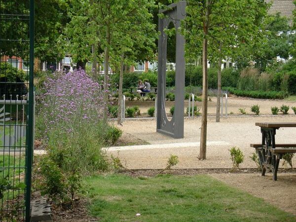
Kevin is sitting on the bench in the park waiting for Alisha
Alisha then arrives and sits next to Kevin on the bench
Kevin: so how come you decided to link up
Alisha: well you don’t seem like a bad guy, so why not
Both characters seem happy as they talk and Alisha texts her boyfriend saying ‘where in the park babe xx’
Alisha’s boyfriend heads/runs towards the park

Kevin slowly leans in to kiss Alisha as Alisha’s boyfriend enters the park and looks around to find Alisha and Kevin.
Once Alisha’s boyfriend spots where Alisha and Kevin are he creeps up from behind, takes his knife out and stabs Kevin from the back.

Pre-Production: Reece

Reece:

Location:

· Wanstead flats.
· Abbots park Leyton.
· Bullying scene (school/college environment).
· Any bus stop.
· Rest of the scenes will take place on various streets.
 
Wanstead flats:
 
Having visited our chosen location for shooting our short film it gave us more of an accurate picture of the feeling of the environment we will be filming in and how this would adversely impact our film. Meaning the effect of filming in such an environment in contrast with the overall idea and intended consequence we hope the viewers will feel. Of course in the picture the location looks bright and attractive however as the weather changes and the time we plan to film, the look of the scene will automatically change. Once we viewed the location it was much easier to visualise where the characters will be placed and when filming how it would all combine together. In this particular scene the main character – Kevin will be walking through and the scenes would reflect his emotions at the time, having an area of this appearance would give the film a much more effective feel in the sense that it creates anticipation when viewed by the audience as Kevin will be alone and the overgrown trees add to this making it that much more nominal. The camera shots at this point would be a tracking shot as the character is walking, as we have shown in the storyboard page 5 scene numbers 5-6.

Abbots Park:

This location is where the majority of our filming will take place. The specific scenes of Alisha and Kevin meeting as well as the murder of Kevin right at the end, such a location demonstrates the reality of such events as they often take place at discrete areas with couples – specifically teenagers meeting in parks which are seen to be calm and relaxed places for them to converse with one another and often enjoy intimate moments. This specific area will be used in our film a great deal and will mark some of the most pivot moments. As depicted in our case studies from our inspirations quiet areas are the targeted hotspot for murder scenes to take place. Therefore having chosen a park would reflect this and contribute to showing the reality of what is being displayed overall impacting the effect this has on the audience. Using an area which is quite accessible for almost everyone would make them conscious and aware of what may take place within it. The image above is of the entrance to the park and this is where the specific scene of the murder will begin to commence. We thought it would be best to position Alisha’s boyfriend at the entrance so we can capture his expressions and emotions as he looks for both other characters in order to execute his move. Not only this but having such a camera focus would improve the suspense and tension between the viewers and the events taking place. What we had in mind was that tension and suspense leads to audience members becoming more aware and focused on the issue being shown and the approximate severity of what is being shown. This has come from experience when me and other members of the team have come across reality films such as the one in our case studies – my murder.
This is another close-up of the location in which the scene where the murderer will be looking around to find the victim – Kevin will take place. We hope to build up the tension at this point as it is the main point which the whole short film is anticipating and therefore the camera shots will be various such as longshot once he arrives, mid-shot when he slowly pulls the knife out, close-up when he is looking for Alisha and Kevin and finally an extreme close-up when he finds them. We need to watch out for any potential hazards such as small children running around and other obstacles such as members of the public who wish not to be filmed however apart from this there are not many health and safety implications we are liable to face.

Within the park this is the particular area in which we will be filming the scenes where Alisha and Kevin meet. At first Kevin will be alone and the filming will reflect his emotions as he will be feeling ecstatic to meet Alisha assuming the feeling is mutual however once she arrives and they get talking he will become more relaxed. At this point he will be using his phone to text Alisha and we will show his emotions while this is happening through close-ups and mid-shots. Once Alisha is at the scene there will be many shot reverse shots as both characters are speaking. Finally Kevin will assume Alisha is interested in him as much as he is and will attempt to place a kiss on her lips and what he doesn’t know is while they were talking Alisha is texting her boyfriend letting him know of their where about. At this point we will show a close-up of her texting and then the various scenes of her boyfriend on his way to the park will take place in a separate location. Using a bench area establishes the relaxation and intimacy Kevin feels towards Alisha as they both will be alone and having the murder take place while this is happening will show how Kevin was unquestionably unaware of the likelihood of such events taking place. This contributes to showing the “honey trap killing” and how secretive it is. After the murder the scene will end straight at that point, ending the film.
College (bullying scenes):
The scenes of Alisha being intimidated by other students are also a major part of the short film. As the scene will be repeated in the form of continuous flashbacks it is important that we are able to film this correctly and accurately. At this point Alisha will be seen leaving college however when approached by two members of the college whom she has straining relationships with things take a turn for the worse when she is unable to handle the pressure leading to her resulting to the extreme lengths of a honey trap killing. Using this environment adds to the realism of the film as such events do actually take place within the environment of peers and can lead to devastating effects on the individual if not tackled. You can then agree that the film promotes two aspects of the events which take place in today’s society both of which need to be tackled. One being bullying and the idea that this needs to stop and the second being not to result to the lengths of the honey trap killing as well as raising awareness of what goes on between different social groups and the role technology plays towards this. Again the issue of making sure we are not filming anyone if they are not willing to will arise in the filming of this scene other than that filming should go according to plan.
A bus stop of the similar looks to this will be used to film the scenes once Alisha has left her boyfriend when he is unable to understand the pressure and trouble she is facing through her daily college life and how much this is having an impact on her mentally and emotionally. The actress will be sitting down with her phone and this is also the scene at which point Kevin calls Alisha and the camera shots will reflect her emotions when he calls such as the close-up to the phone.
Remainder of the scenes such as when Alisha first comes into contact with Kevin and when she meets her boyfriend at various times will take place on a variety of roads which are of convenience to the actors and the camera crew. Filming these scenes will require us to ensure continuity however there is no set location for this as using any road will near enough create the same effect we need.

Pre-Production: Storyboard